2018-09-13 更新
原文地址:http://www.cnblogs.com/lyzg/p/4877277.html
目前很多流行的,html5要适应各种分辨率的移动设备,应该使用rem尺寸单位,各个分辨率范围在html上设置font-size.
这里介绍我们项目组在用的适配方案:
页面加载的时候通过js计算出html的font-size。
计算和设计稿有关
拿网易来说,它的设计稿应该是基于iphone4或者iphone5来的,所以它的设计稿竖直放时的横向分辨率为640px,为了计算方便,取一个100px的font-size为参照,那么body元素的宽度就可以设置为width: 6.4rem,于是html的font-size=deviceWidth / 6.4。这个deviceWidth就是viewport设置中的那个deviceWidth。1
2
3
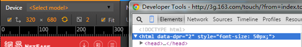
4deviceWidth = 320,font-size = 320 / 6.4 = 50px
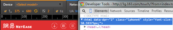
deviceWidth = 375,font-size = 375 / 6.4 = 58.59375px
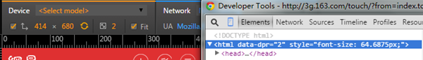
deviceWidth = 414,font-size = 414 / 6.4 = 64.6875px
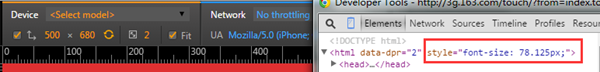
deviceWidth = 500,font-size = 500 / 6.4 = 78.125px
事实上网易就是这么干的,你看它的代码就知道,body元素的宽是: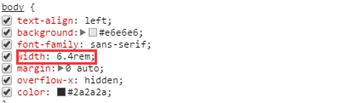
根据这个可以肯定它的设计稿竖着时的横向分辨率为640。然后你再看看网易在分辨率为320680,375680,414680,500680时,html的font-size是不是与上面计算的一致:
贴上代码:1
2
3
4
5
6
7
8
9
10
11
12
13
14
15
16
17
18
19
20
21
22
23
24
25
26
27
28
29
30
31
32
33(function (doc, win) {
var docEl = doc.documentElement,
isIOS = navigator.userAgent.match(/iphone|ipod|ipad/gi),
dpr = isIOS? Math.min(win.devicePixelRatio, 3) : 1,
dpr = window.top === window.self? dpr : 1, //被iframe引用时,禁止缩放
dpr = 1, // 首页引用IFRAME,强制为1
scale = 1 / dpr,
resizeEvt = 'orientationchange' in window ? 'orientationchange' : 'resize';
docEl.dataset.dpr = win.devicePixelRatio;
if(navigator.userAgent.match(/iphone/gi) && screen.width == 375 && win.devicePixelRatio == 2){
docEl.classList.add('iphone6')
}
if(navigator.userAgent.match(/iphone/gi) && screen.width == 414 && win.devicePixelRatio == 3){
docEl.classList.add('iphone6p')
}
var metaEl = doc.createElement('meta');
metaEl.name = 'viewport';
metaEl.content = 'initial-scale=' + scale + ',maximum-scale=' + scale + ', minimum-scale=' + scale;
docEl.firstElementChild.appendChild(metaEl);
var recalc = function () {
var width = docEl.clientWidth;
if (width / dpr > 640) {
//width = 640 * dpr;
}
docEl.style.cssText = "font-size:"+(40 * (width / 640)) + 'px!important';
//docEl.style.fontSize = 40 * (width / 640) + 'px';
//document.body.style.width = 16rem;
};
recalc()
if (!doc.addEventListener) return;
// win.addEventListener(resizeEvt, recalc, false);
})(document, window);
还有,如果采用网易的这种做法,视口要如下设置1
<meta name="viewport" content="initial-scale=1,maximum-scale=1, minimum-scale=1">